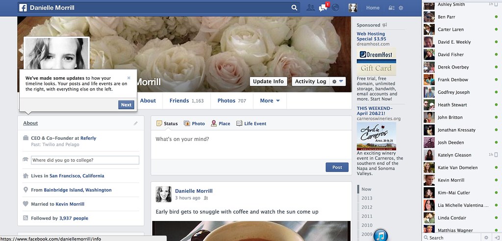
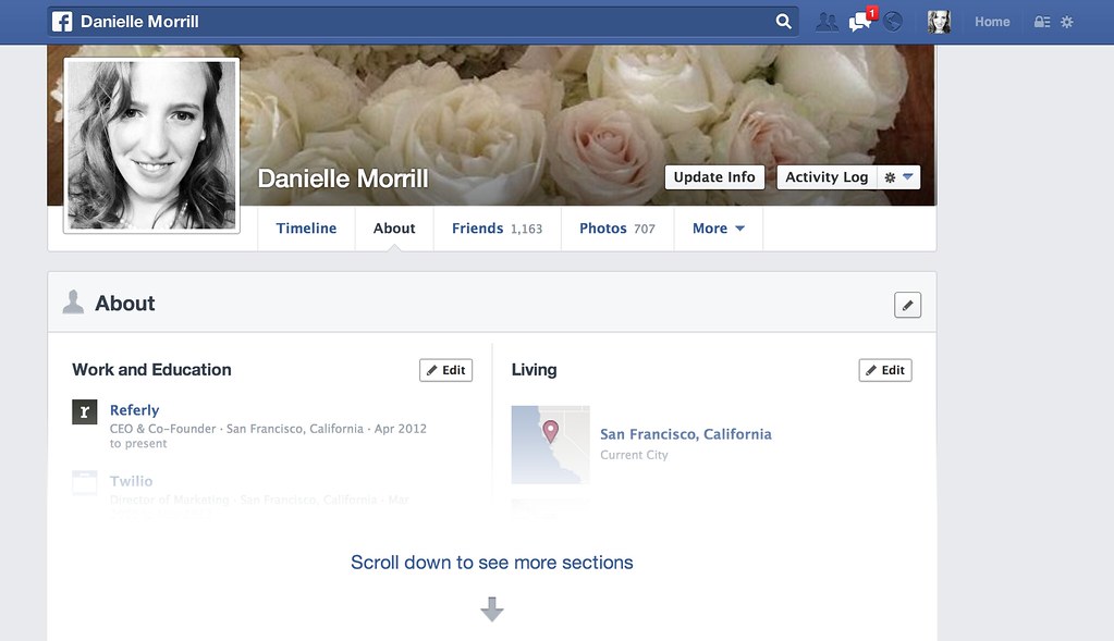
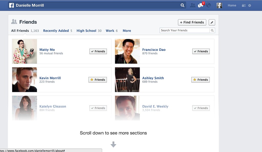
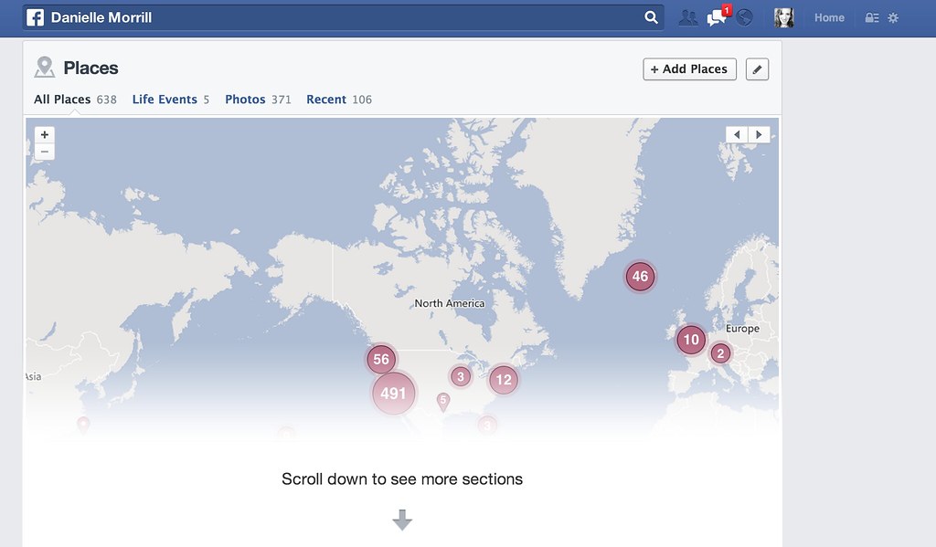
Over the past few days friends have been remarking that they’ve seen various pieces of Facebook’s new design rollout, including various shades of blue for the top bar. I had yet to see anything resembling the new design they hinted at earlier this month until today. I opened up my profile page and there it was, the new layout for profiles with a little tour to help me check it out. My overall reaction is that it is pretty and feels like a subtle change after a few minutes using it. I like that my about page is a bit more interesting and that pictures are bigger. It feels glossier like a magazine.
I snapped some screenshots, since I’m not sure what my profile page will look like for others:


