If you haven’t heard, Referly is switching gears to avoid becoming a “Zombie Startup”, and we’ve already posted a high level summary of our metrics on the front page of our site. This post is part of my ongoing retrospective, which is helping me get some closure while we incubate our next direction as a company.
Until 3 weeks ago I woke up early every day, eager to check our internal dashboard, Amazon Associates and Skimlinks and update a couple spreadsheets, set a goal or two for the day to keep us on track, and send an update email to the team with any adjustments to the week’s plans. There’s nothing I love more than operating the day-to-day. It was a joy to plow full steam ahead with our team of 8 content, engineering, and outreach folks. Seeing these numbers drop over the past few weeks has been painful, so after I post this it will be the last time I visit these operational tools for awhile, and probably my last post about Referly until we share what we’re doing next. Memento mori
I offer these metrics to you without analysis… and look forward to answering your questions and providing more insight in the comments depending on what you’re interested in.
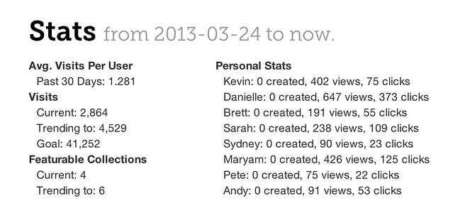
Weekly Pace & Contributur Stats At A Glance
Each week we’d set goals for the week in our Monday team meeting. At our peak, we produced nearly 100,000 pageviews in a single week. The “X Created” stands for collections created. Engineers were asked to created 7 per week (and they were awesome!), everyone else on the growth team (myself, Andy, and our wonderfully creative interns) created 20-40 depending on our goals and the seasonal campaigns going on.
These show 0 created for everyone because this is a snapshot from today, but normally this would show the number of feature-worthy collections created (has cover photo, title, description, at least 3 pieces of content).
Daily & Monthly Stats
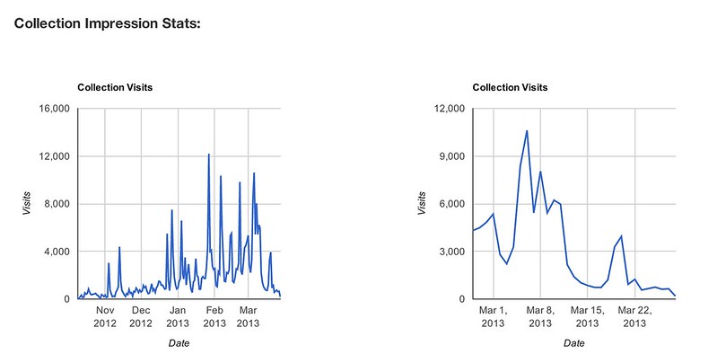
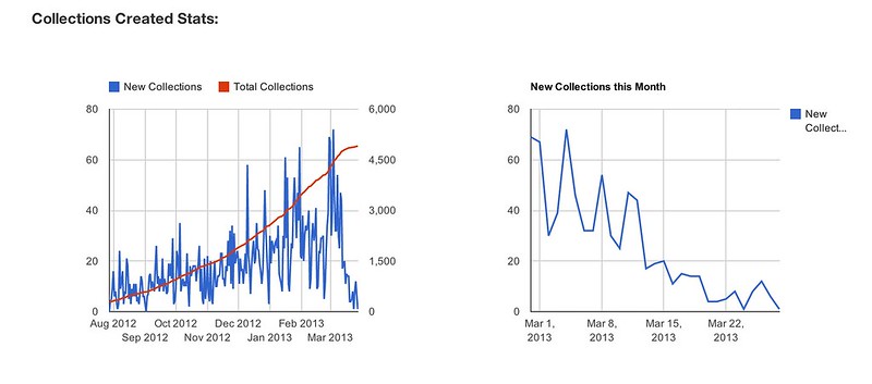
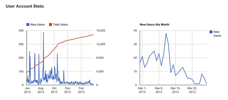
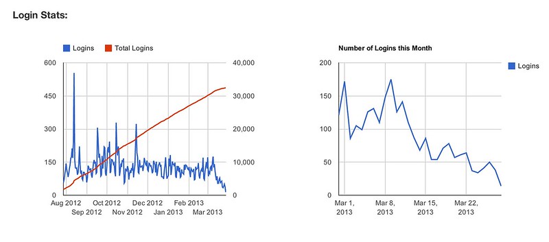
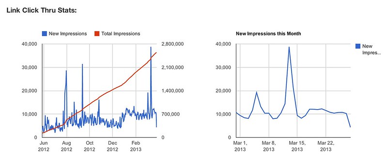
For each metric the graph on the left shows daily stats for all time, and the graph on the the right shows daily stats for the current month (so you can see more detail).

That’s it.
Show Me the Money
You might be wondering why we didn’t share a graph for revenue or gross merchandise sold. This is intentional. I believe that whatever you measure and share is what people will focus on. Having a dashboard for individual revenues earned, or each aggregate revenue, would distract us from our number one priority: creating awesome content people would love reading and sharing. While I tracked this data and shared it with the team periodically it was never the focus of their attention. I set out content generation and traffic goals based on the ultimate revenue goal, but revenue wasn’t something the content team worried about from day-to-day.


Sometimes I wonder whether we would be pivoting now if every person in the company had been focused on maximizing revenue in every piece of content they produced from day one. While I think we might have earned marginally more money in the short term, I think the quality of our content would have been much lower overall and ultimately we wouldn’t have been able to attract the right readership or community of content producers.
To Be Continued…
Over the past year I’ve shared more about Referly than I ever expected to, and I hope seeing these metrics gives you (especially other founders) a sense of what things look like under the covers of a company that is growing, hitting goals and getting PR. Personally, I have learned so much about how to operationalize a technology-enabled media business that consistently puts out content that drives meaningful traffic and keeps people coming back. While we are no longer paying rewards, people from our community of more than 25,000 writers are still logging in and producing new content every day with our awesome edit-in-place CMS. You can absolutely sign up to use Referly as it is today (this link can’t be found on the site, just a little perk for my readers!), and you’ll be among the first to hear what’s next.
—
Do you need to create a business dashboard for your company? This one of my favorite things to do as a company mentor/advisor, and right now I am looking for opportunities to try different approaches and use some of my spreadsheets and other graphing and analytics packages. If you are interested, and willing to pay for my time (in money or beers or coffees) please get in touch at morrilldanielle (at) gmail.
Amazing post, Danielle. I’m curious what tools you are using for your stats; this is quite pro!
Why are you pivoting? You claim your business goes well and post some random numbers on the home page. You pulled in your family into this, and when you started, you said you are going to follow your passion which at that time was ‘referly’.
Now all of a sudden referly’s core business model looks like a bad idea and you want to pivot to something else.
I’m sorry but, you are a very wrong example of an entrepreneur. A true entrepreneur will follow his/her passion no matter what, but it seems to me that your definition of passion is so horrible that you can change/focus your passion onto something else as you please. How do you expect your customers to trust you if you are going to be so confused and unpredictable yourself?
Please do us all a favor and stop calling yourself an entrepreneur. It means something else entirely, of which you aren’t even close to 1%.
While we could make some graphs look good in the short-term, the long-term prognosis for a company with our model will turn it into an epic slog where no one wins:
http://www.daniellemorrill.com/2013/03/zombie-startups/
http://www.avc.com/a_vc/2013/03/when-things-dont-work-out.html
Following my passion no matter what is exactly what I am doing, but if you’re looking for the entire story to play out in the length of a blog post you’ll be disappointed. This stuff takes a long time.